Fonts play the most important role in design: they create a mood, instil emotions, and help the perception of the image even before reading the text.
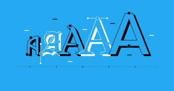
- ContrastThe difference between the thickness of the main and additional strokes is called the contrast of the font. Contrast determines the font’s position on the readability/aesthetics scale. Weak and medium contrast helps with long reading and does not always create a special mood, while extreme values: zero and strong contrast, form expressive artistic images. So when using a titles fonts, contras is pivotal.
With a complete lack of contrast, the inscription looks simple and laconic, sometimes even primitive. Non-contrast typefaces break the connection between typesetting and handwriting, drawing on industrial and post-industrial urban aesthetics in all its manifestations, from stick fonts to neon signs. These features make non-contrast fonts an excellent solution for anyone who wants to look modern and progressive.
Click here – What Is Deep House?
A very strong contrast is an artistic technique characteristic of the fonts of romanticism and classicism. Contrasting fonts sacrifice readability for the beauty of the title page of the cover or poster. The alternation of thick and thin lines resembles a dramatic confrontation of strength and weakness, ice and flame, and the combination of different contrasting forms creates a graceful silhouette and rhythm reminiscent of music or choreography. It makes sense that contrasting fonts work so well for theatre, fashion and luxury.
2. Line height
The height of line letters (X-height), relative to headings and their own floating elements, is one of the main features of the font that determine its use. Also, the mood and character of the message depend on the height of the lines.
At an average ratio (from 2/3 to 3/4), upper and lower case letters maintain a balance of similarity and difference, which makes it easy to find the beginning of a sentence, but does not distract from reading. This moderation, along with other properties, makes the font comfortable to work within a text.
A small line height (1/2 and less) creates a serious difference between letters within the same font. The font becomes twice as diverse and interesting as its medium-value counterpart. The greater this difference, the better extroversion, musicality, and artistry are conveyed. These qualities are great for small personal or artistic texts: poems, greetings, invitations, and posters.
High lines (More than 3/4) make the font more uniform (upper and lower case letters are similar to each other), so you can type more text with this font foundry. Due to the smaller headings and insignificant outlying elements, the lines of text interact little with the surrounding space. These are introverted fonts that carry a sense of stability and security, but they sometimes lack friendliness.
Click here – Significance of Touch for Infant Well-Being
Summary
- Contrast adjusts the level of artistry of speech: from a machine speech synthesizer (Zero contrast) to a Grand Opera soloist (Maximum contrast).
- The height of the lines is related to the desire to impress the viewer: from a love letter (small lines) to an indifferent sign “Break” (large lines).